BackHug
Creative & Marketing Lead
2020 - 2026
BackHug had developed a genuinely impressive robotic device to treat spinal joints but, as an unknown startup asking customers to trust a machine to manipulate their spine, the company faced an uphill battle to earn trust, credibility and the market positioning needed to gain traction.
I initially joined as UI/UX designer and evolved into leading the entire creative and marketing operation, shaping the company's positioning, brand identity and growth strategy, helping them grow and eventually expand into the US.

Brand Strategy
UI/UX Design
Content Strategy
Paid Growth
Conversion Optimisation
Research & Positioning
Before starting the rebrand, I began with competitor and audience research, analysing how established health-tech brands like Peloton, Kaia and Therabody made their science accessible and exciting.
This helped clarify how BackHug should position itself: as a serious health-tech brand rather than an unproven medical device. From this, I defined a brand direction focused on education, credibility and premium design.
Rebranding & UI/UX Updates
I pitched and led a full internal rebrand: logo, typography, colour palette, iconography and brand guidelines. The aim was to balance what one would expect from a medical and educational brand with what would also be expected from a premium technology company.
Rebranding & UI/UX Updates
I pitched and led a full internal rebrand: logo, typography, colour palette, iconography and brand guidelines. The aim was to balance what one would expect from a medical and educational brand with what would also be expected from a premium technology company.


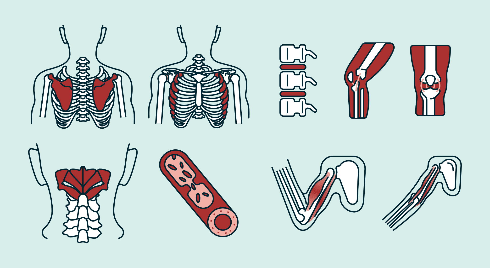
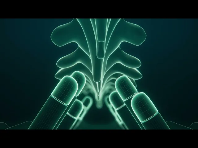
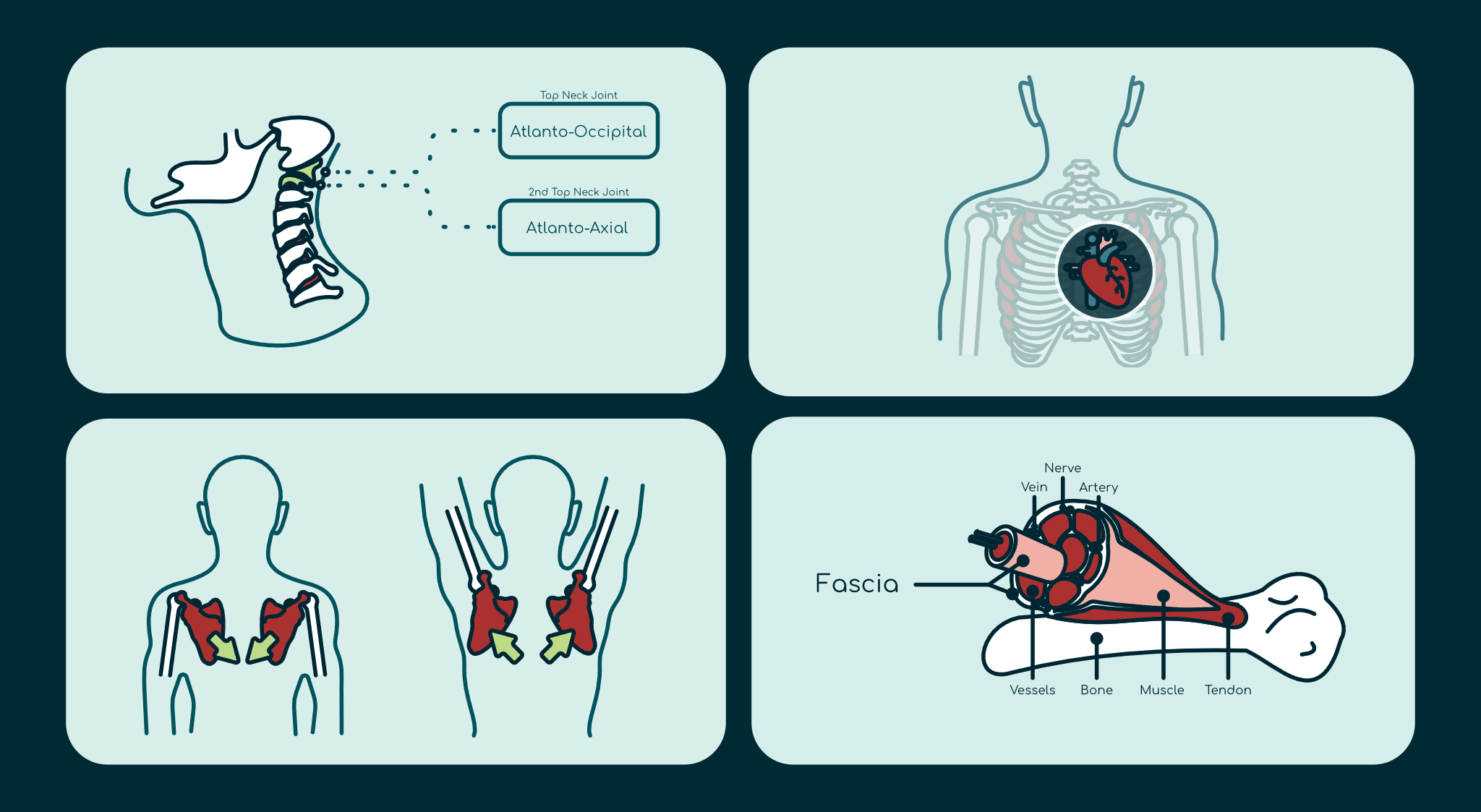
One of the most important brand assets was making the technology itself understandable. I created a series of medical illustrations showing how nerve compression occurs and how BackHug's robotic fingers decompress spinal joints. Then we worked with an external CGI artist to produce a 3D animation that clearly showed how the robotic fingers treated the spine.
One of the most important brand assets was making the technology itself understandable. I created a series of medical illustrations showing how nerve compression occurs and how BackHug's robotic fingers decompress spinal joints. Then we worked with an external CGI artist to produce a 3D animation that clearly showed how the robotic fingers treated the spine.
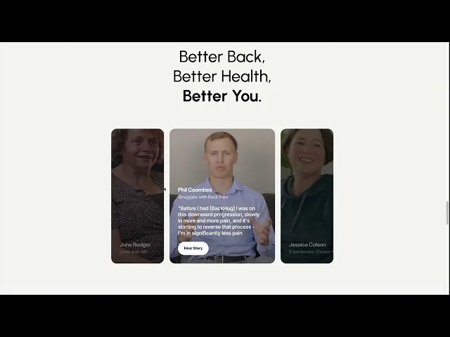
Website & Content Strategy
I redesigned and rebuilt the website (several times) around how users were actually processing information. The core site was structured around three pages covering the device, the science and technology, and customer testimonials, keeping things focused and digestible for a new audience encountering an unfamiliar product.
Alongside this, I developed a content strategy built around landing pages and a blog, designed to grow into a comprehensive health and educational library centred around back health over time.
Community & Organic Growth
BackHug's audience often includes people living with conditions such as Parkinson's, multiple sclerosis and chronic fatigue, so my approach to marketing has always been human-first. I'm very conscious that people engaging with our content may be dealing with pain, stress or uncertainty, and I always aim to cut through jargon and communicate with empathy. Even when content has a marketing goal, I try to ensure it offers genuine support and practical value regardless of whether someone converts.
With that as the foundation, I developed a content strategy centred on back health education and community building rather than purely product promotion.
Social channels grew by 200%
Daily website visitors increased from 20 to 100+


Paid Aquisition
& Conversion Optimisation
I built a multi-stage funnel across Meta and Google covering awareness, consideration and conversion.
Peak CTR of 7.36%
CPC as low as £0.29
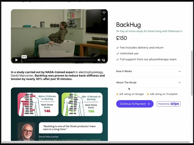
When conversions plateaued at 2%, I used Google Analytics and Tag Manager to analyse user behaviour. Scroll-depth data revealed users weren't engaging past the hero section — so I had clear evidence of the problem and a clear brief to fix it.
Paid Aquisition
& Conversion Optimisation
I built a multi-stage funnel across Meta and Google covering awareness, consideration and conversion.
Peak CTR of 7.36%
CPC as low as £0.29
When conversions plateaued at 2%, I used Google Analytics and Tag Manager to analyse user behaviour. Scroll-depth data revealed users weren't engaging past the hero section — so I had clear evidence of the problem and a clear brief to fix it.

I restructured the hierarchy of the landing page to bring all the good stuff (ie: persuasive content) into that top 25% and made it sticky so that it always appeared on screen. This led to:
conversions more than doubling to 5%
generating £15k+ in revenue over six months.
I restructured the hierarchy of the landing page to bring all the good stuff (ie: persuasive content) into that top 25% and made it sticky so that it always appeared on screen. This led to:
conversions more than doubling to 5%
generating £15k+ in revenue over six months.
Result
BackHug expanded into the US, partnered with elite sports teams including the Chicago Cubs, Texas Rangers and Utah Jazz, and earned coverage in The Guardian, Financial Times, New York Post and the BBC.
Result
BackHug expanded into the US, partnered with elite sports teams including the Chicago Cubs, Texas Rangers and Utah Jazz, and earned coverage in The Guardian, Financial Times, New York Post and the BBC.